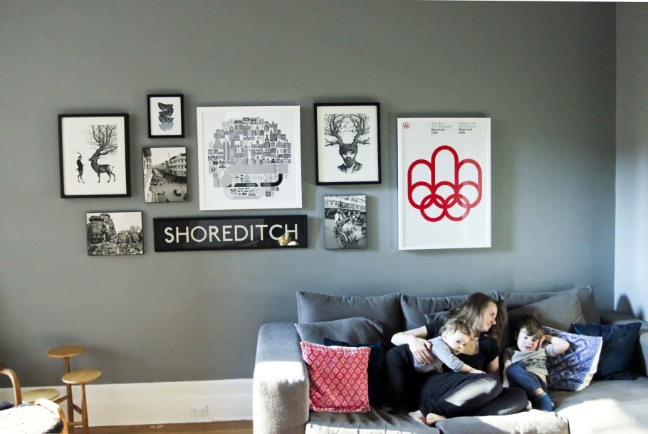
We moved into our house a little over a year ago and are slowly, slowly getting things in order. One of the last things we have focused on is putting beautiful things on the wall. This is probably because we are cautious. In other houses I’ve lived in I just threw up stuff on the wall and often regretted it. But, I never wanted to move it because of the holes left behind. Not good.
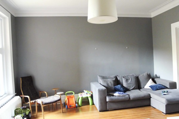
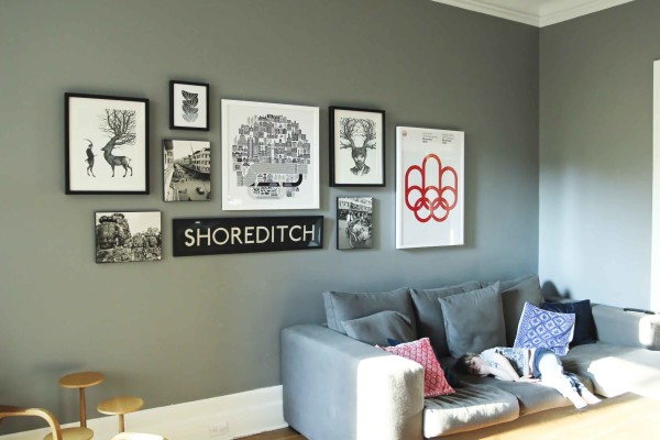
So we left the wall above as-is for over a year. I knew we wouldn’t have art big enough to fill the wall, so instead I thought about putting up a gallery wall. I wanted a common theme throughout the images so I took all our unused framed prints and looked for a common thread. Black and white was pretty darn obvious.
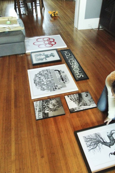
We had most of the art already but bought the Raymond Biesinger Montreal print, the bowls print and the Montreal Olympic print. I am not into frames that are too matchy so we framed the Olympic print and Montreal print in white. We already had a frame for the bowls which was just a simple one from Ikea.
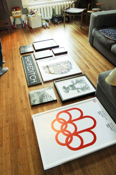
I had a friend came over and we laid out the frames on the floor to see what would work best. I highly recommend doing this with an extra set of eyes. Once it’s on the wall, it’s pretty much there forever.
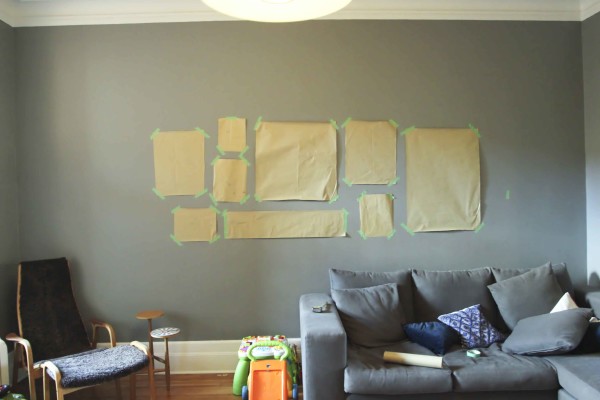
Using kraft paper I bought from the dollar store, I cut a piece to match each frames size so we could stick it on the wall. In the past the big drama was always around where to put the darn nail and this took out all the guessing. We measured between each print and carefully marked where each nail would go. Again, I highly recommend you get a helping hand for this part.
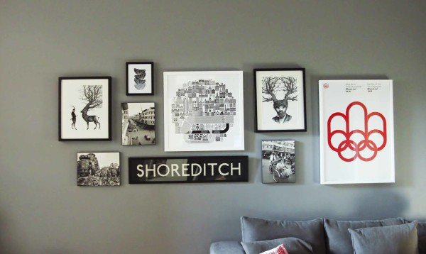
Art Clockwise L-R: Deer and Man (bought from the artist at a market in Brick Lane, London), Bowls, Montreal by Raymond Biesinger, Man/Deer Hybrid (bought from the artist at a market in Brick Lane, London), Montreal Olympic print, Phnom Penh (taken by me using B&W film!), original Shoreditch bus sign, Phnom Penh (own photo), Angkor Wat (own Photo)
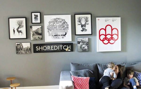
While I took the boys to the park my husband was able to put up all the frames by himself using the kraft paper as a guide. I was so so pleased with the result.
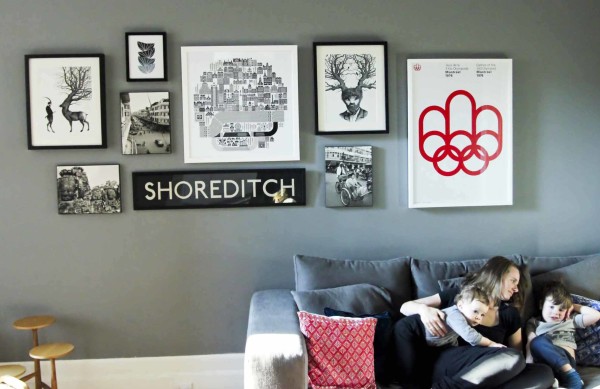
It’s not too matchy but there’s a common theme. There’s different shapes and there’s a splash of colour. There’s also room to grow.
I followed the tips from this post including:
- Find a common theme.
- Use different shapes.
- Hang at eye level. We chose to hang at around 10 inches above the couch because of the kids.
- Try to space the art roughly 3 inches apart.
- Start with the biggest piece and put it off centre.
I am so pleased with our wall. We did it! I can’t stop staring at it. Now for the rest of the house…
Check out the other B&W prints that I had chosen for the wall.
Thanks Jenny for your keen design eye, tips and help!
Also check out how we redid the nursery here.
Can’t get enough? Subscribe and I’ll send you my weekly post roundup right to your inbox! You can also keep up to date by following me on Instagram, Facebook, Pinterest and Twitter.
Leave a Comment cancel






this looks great, michelle! i always do such a hack job on my gallery walls. i love hanging art but am so haphazard about it!
Thanks so much Emily! It was a looong time in the making 🙂