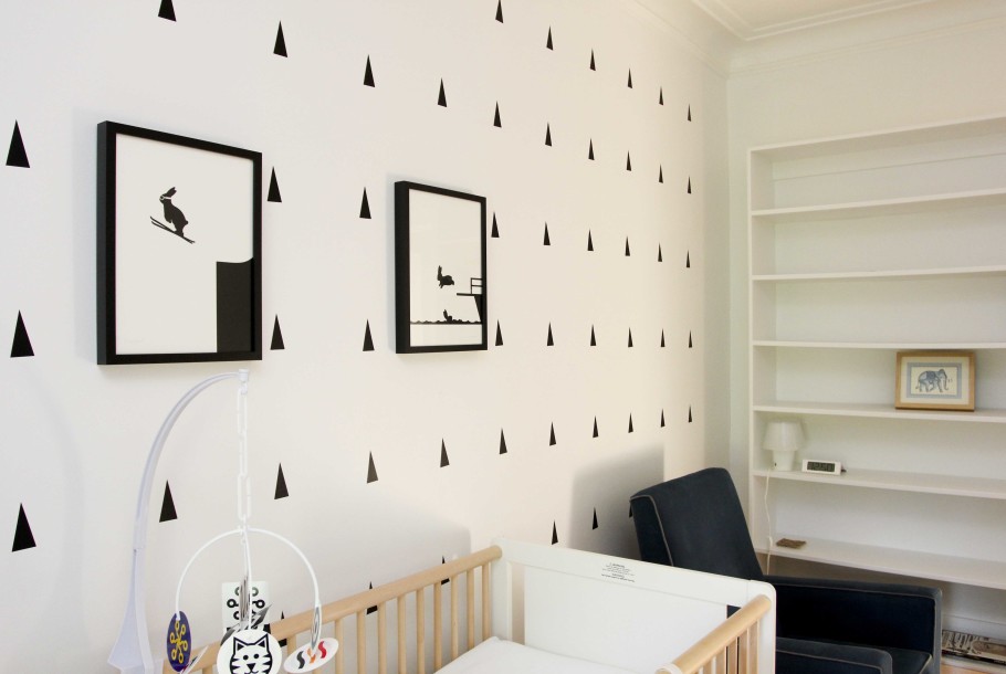
A while back I posted some modern nursery ideas and now I can finally reveal our nursery (mostly because I just put up all those damn triangles this morning.)
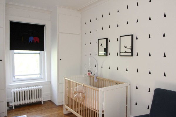
We are lucky enough to have four bedrooms and although this one is the smallest, it’s still the perfect size for a nursery. Unfortunately, it was painted a golden yellow colour which was just not what we wanted. I surprised myself by wanting an all white nursery. I’ve had an aversion to white ever since my university/post university days when I lived in apartments which were always painted all white. When I finally got my own places I wanted a little colour in my life. But I’m past that now and I love the look of the black and white.
In specific there are two things good about black and white. First, it’s pretty easy to find stuff to fit the theme and secondly a lot of the stuff we bought will work for years to come.
So here’s what we did:
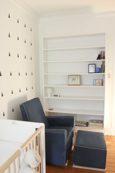
-Painted the entire room Benjamin Moore’s Drumskin White. We chose this colour because we knew this was the white that was used in the rest of the house and on the ceiling. My husband did pretty much all the work so I’ll give him a shout out now. Those built in shelves were a nightmare.
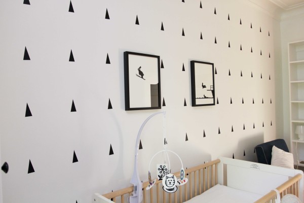
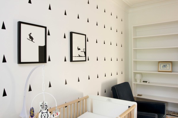
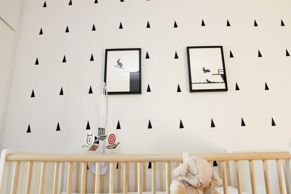
-Put up ALL THOSE TRIANGLES. I got mine from Designee on Etsy and I thought the price was very reasonable. I started just throwing them up thinking they would be straight but no no no – serious measurement was needed. Songza’s songs from Apple commercials played in the background while I measured and stuck.
-Bought the two prints from HAM . Frames are from Ikea.
-Reused our Oeuf Robin Crib, Wimmer-Ferguson Infant Stim-Mobile (which was handily black and white mostly), and Sleep Sheep.
-Bedding was borrowed from family. We also have plain white bedding from Ikea.
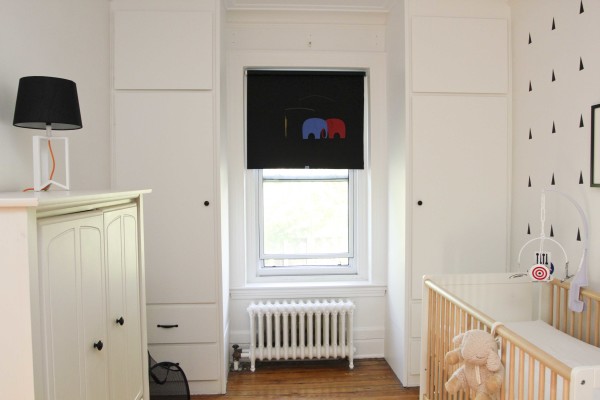
-Changed the brass knobs on the built ins for black hardware from Home Depot.
-Installed a black roller blind from Ikea that I hacked away at with a wood saw until the fireplace repair man saw what I was doing, took pity on me, and lent me his miter saw so I could cut down the metal tube to size. It’s blackout which is perfect.
-Reused our Flemsted mobile and hung it in front of the roller blind (you can just see that it’s red, blue and yellow elephants.) I know it’s not black and white but it looks nice against the black.
-Reused our custom glider chair which we got from PinkiBlue. Bastien and I spent HOURS in that thing. You can see we set it up next to the built in book shelf and my coasters, little lamp from Ikea and a small clock from Ikea are at the ready. There isn’t too much in the book shelf right now, but I’m sure that it will slowly get filled. There’s also an elephant print I got from The Jim Thompson House back when I was living in Bangkok and a photo of my husband as a toddler. The bottom shelf holds the complete collection of TinTin comics.
-The white piece of furniture to the left is painted Pot of Cream from Benjamin Moore which unfortunately is just a shade off of the rest of the room, but it’s fine. It doesn’t bother me too much. It used to have silver knobs which we changed for the same black knobs as the built ins and I actually prefer it.
-The black and white lamp sitting on top is the only light source in the room (besides the small lamp next to the glider) and it was from Target. You can just see the black laundry basket peaking out. It’s from Ikea.
-Other work we had to do was seriously air out the built ins at the back. The house is from 1898 and I think those must have been put in around 1920 and never opened again (OK – I have no idea but they were stuffy – like grandmas attic.) We kept them open nearly a week and put dryer sheets in all the drawers. The drawers are old school wood on wood so we stuck stuff in there we wouldn’t need to access all the time.
-We eventually will have to put Bastiens diaper change table in this room. We decided not to buy another one after the advice of a friend. We are going to start changing Bastien standing up in the bathroom trying to reinforce the fact that he is getting too old for diapers. We bought a second diaper genie for this. I am a bit terrified to start doing this. Pee is fine, but the kid is a runner and the thought of having him run away half way through a diaper change is both completely realistic and disgusting. Sigh.
Well that’s it!
At the time of writing my husband doesn’t know about the triangles… fingers crossed he likes them as they were a PAIN to put up. I see why many people put them up in a more abstract fashion.
What do you think? Please tell me you love it!
Leave a Comment cancel











I think you did an amazing job decorating the nursery! And honestly, any little colored elements you add to the room are going to pop and stand out brightly! Love it!
I love it! It is really lovely!
Love it! Question, where did you find the adorable bunny swimming and bunny skiing art? I’m obsessed!
Thanks! They are from HAM Prints
Pingback: Kitchen Prints | Roasted
Pingback: It’s all in the attitude | Roasted
Pingback: Beautiful Prints and Unique Objects by Abricotine | Roasted